B2B Fintech Website Design
UX, BRANDING, DESIGN SYSTEMS, AND CONTENT MARKETING – MADE WITH REWARDS NETWORK
TL;DR
Led the transformation of RewardsNetwork.com to boost B2B engagement and lead generation. We created a modern web experience that resulted in a 98% increase in unique monthly visitors and a 243% rise in marketing-attributed deals
RESPONSIBILTIES
UX Strategy, Creative Direction, Product Workshops, User Testing, Responsive Design, Design Systems, Copywriting and Tone of Voice, Development Handover, Motion Design & Video Production,
PEOPLE
1x Visual Designer
1x Copywriter
1x UX Designer
2x Product Developers
TIMELINE
3-4 Months
RewardsNetwork.com played a vital role in driving business development and generating demand. However, despite our to-date marketing efforts, conversion rates remained disappointing for the previous site. The conversion rates were mediocre, and the previous site structure, design, and content were in need of a complete overhaul.
The target audience for RewardsNetwork.com is B2B customers, specifically restaurant and small business owners who seek to attract a steady stream of customers while also exploring smarter capital options for their ventures.
I spearheaded a transformation of the corporate site and all of its digital experiences. Collaborating closely with C-Suite Executive and Sales leadership, we crafted a modern and responsive web interface that effectively communicated the company's value proposition to the restaurant industry. The new site was designed to increase engagement, build brand awareness, and convert more B2B traffic into qualified leads.
The results of the new site design, structure, and UX were significant. There was a 98% increase in unique visitors to the corporate site each month, and a 243% increase in marketing attributed deals from 170 in year one to 584 in year two post launch.
A Bold First Impression, Then Built for Action
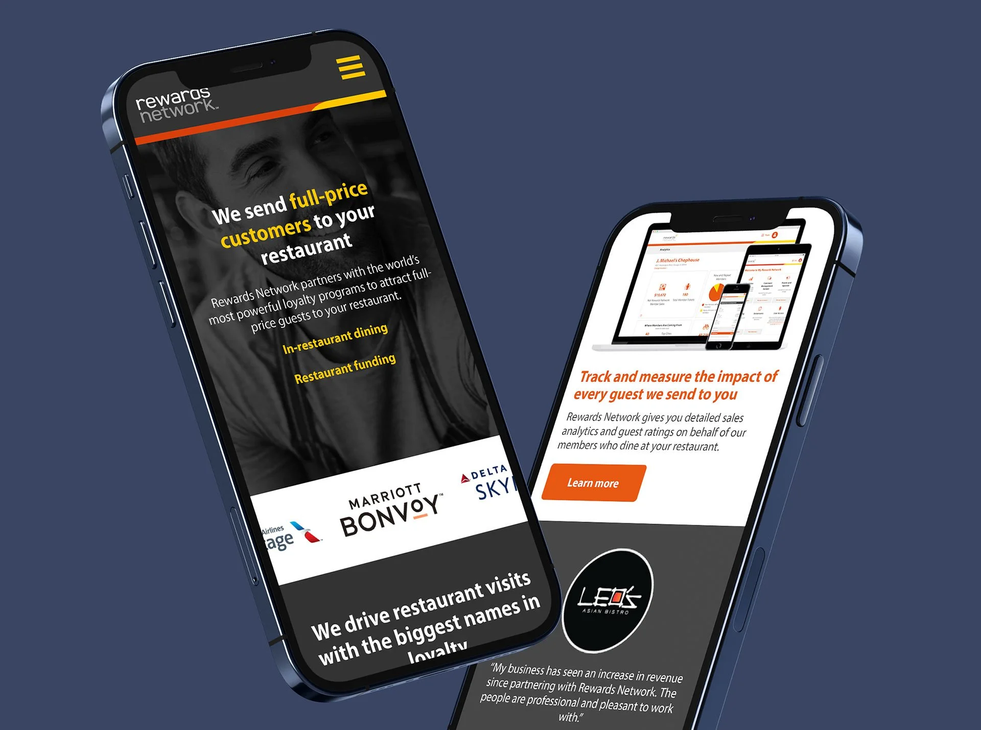
The new RewardsNetwork.com opens with what matters most: a clear, bold statement of value, shown through mobile-first visuals that mirror how restaurant owners experience our brand in real life. This hero moment is not just eye-catching, it is conversation-matching, built from direct input from the sales team and field reps to align our story with how it is actually told.
Immediately following, users step into an upgraded UX experience that simplifies navigation, sharpens messaging, and drives clarity at every turn. A streamlined top-level menu and category-based layout help visitors quickly grasp what Rewards Network does and how it helps restaurants grow. From the homepage to key sections like "How It Works" and "Program Benefits," the redesigned site was built to guide users with purpose — surfacing the right messages at the right moments to increase understanding, build trust, and drive action.
RewardsNetwork.com Design System
One Unified Voice, Across Brand and Web
Simple, Strong Language That Speaks Their Language
Sales teams told us the old site didn’t reflect how they actually talked about Rewards Network in the field. So we listened — then rewrote. We refined the messaging to better match real conversations, bringing in language that’s clear, confident, and benefit-forward. The result is a story that feels more aligned, more direct, and more relevant to the restaurant partners we serve.
Messaging That Connects and Clarifies
We reworked our messaging to speak more directly to restaurant owners, using clear, active language that shows how we help drive growth. Instead of relying on broad claims or jargon, we focused on the real value we deliver: full-paying customers, loyal repeat visits, and better business outcomes. We also reshaped how we talk about new guests and clarified our ownership of the program, all while staying true to how our team talks in the field. The result is messaging that feels more honest, more relevant, and more effective.
Design That Works Hard Without Feeling Heavy
We reimagined the site layout to create a cleaner, more intuitive experience. That meant simplifying navigation, tightening the content structure, and introducing custom iconography that supports the brand story. We also focused on flow by using visual hierarchy, negative space, and thoughtful interactions to guide users without overwhelming them. The result is a site that looks better, feels easier, and works smarter for every visitor.
One Platform, Built Around What Matters Most
At the heart of Rewards Network is a single, connected platform designed to help restaurants grow. While it offers capital, its true power comes from what drives long-term success — access to iconic dining rewards brands, full-paying guests, smart data, and measurable marketing impact. We focused the messaging on what matters most to restaurant owners: visibility, loyalty, and results they can actually see.
Content That Converts, Not Just Fills Space
To turn more B2B traffic into qualified leads, we focused on what restaurant owners actually find valuable; tools they can use, stories they relate to, and insights they trust. Gated content like eBooks, case studies, and interactive tools became our key drivers for lead generation, outperforming organic and sales-led traffic. The strategy wasn’t just about volume, it was about attracting the right audience with the right content at the right time.
A Smarter System for Smarter Content
As part of the full brand refresh, we built a scalable design system for downloadable content that balanced speed with consistency. Each eTool and eBook was templated to streamline creative time while staying visually distinct. Color-coding helped users quickly identify content by topic — green for Finance, blue for Marketing, navy for Operations, and plum for Management. The visuals were designed to work hard across formats, from landing page thumbnails to full downloads, ensuring every piece felt cohesive and on-brand.
INFORMATIVE EXPLAINER VIDEOS
Our site's explainer videos play a crucial role in simplifying complex concepts and assuring potential buyers. They clarify our program's mechanics and the value of services like marketing and capital funding. These videos also encourage self-service exploration and boost confidence in engaging with our offerings, day or night.
VIDEO TESTIMONIALS + CASE STUDIES
I directed and produced 20+ restaurant video testimonials for Rewards Network and their Sales team. Here are two recent testimonials from Good Eats Group in Chicago and Papa’s Raw Bar in Pompano Beach, Florida, along with video case studies for Dan Tana’s in West Hollywood, California. These videos served as social proof, reassuring restaurant owners through the experiences of their peers.
The Rewards Network rebrand and responsive web app launch were a hit, driving impressive results. Unique visitors to the corporate site surged by 98%, from 74,000 to 147,000 per month. Our strategic approach, featuring gated content, engaging videos, and streamlined lead generation, led to a remarkable 243% increase in deals, from 170 to 584, reinforcing Rewards Network's industry presence.
This rebrand significantly boosted revenue-generating products, like capital funding, by 49%, with over $8 million funded in six months. The new brand perfectly conveys the mission of supporting local restaurants with technology, data, and unwavering commitment.
This project highlights the power of creativity and innovation, driven by a dedicated Sales team and a skilled group of professionals. As Rewards Network continues to grow, it's a testament to the impact of embracing a brand's true purpose and connecting deeply with its audience.


